| Apologies first to
Photoshop 4.0 users for not realising
earlier that the instructions I initially
provided for this technique related to
version 3.0 only and would not work with
version 4.0. After years of giving
Channel Operations a wide berth, I
finally discovered what a valuable asset
they are for techniques such as this.
More images to follow soon on this page. The cross-process technique
is kind of similar to a colour
manipulation method outlined in a
previous Design matters feature where
colour shifts were created by multiplying
or screening the densities of individual
colour channels. Here, the technique has
been adapted to match what happens when
colour negative C-41 film is processed in
E6 transparency chemicals. The highlights
become compressed in the yellow and
magenta layers, so pure whites appear
pinky-orange and shadow tones will
contain a strong cyan / blue cast. Most
of the mid to highlight detail (like skin
tones) will get compressed or lost ,
which is probably why many music
photographers prefer to photograph their
spotty teenage subjects this way when
there's no budget for a make-up artist.
This is a destructive digital technique,
but arguably less so than if you were to
follow the photo-chemical route. Once
film is over processed there is no way of
restoring lost detail. One can pretty
accurately match the film colour effects
with Photoshop and choose to retain more
detail than you would get otherwise.
Remember to keep a close eye on the info
box! You may end up with some very heavy
ink percentages.
|
 |
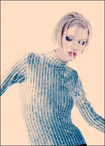
1 Before commencing
, it is important that the image
should be in CMYK colour mode
with the levels and curves fully
corrected. In the case of
portraits, the skin tones should
ideally be nice and light as
shown above. Prepare the screen
layout with the channels palette
visible. Activate the Yellow
channel by highlighting it, but
keep the eye icon for the CMYK
channel switched on - this
enables you to see the colour
changes as they happen.
|
|
| 2 Choose Image
> Apply Image. Check the Invert box
and set the blending mode to Hard Light
between 40% - 50%. Check the Preview box
as well to preview the channel operation
effect in the image window. |
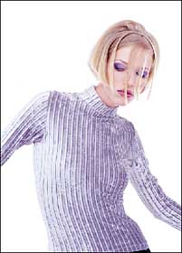
| 3 After applying
the effect to the image, you should see
the colour change to look as if has has
been photographed through a strong yellow
filter. |
| 4 Repeat the
process on the Magenta channel, but take
the opacity down to somewhere in the
region of 25% - 50% and set the blending
mode to Normal (or you could experiment
with Hard Light). |
5 Go to the Cyan
channel. Choose Image > Apply image
again and this time do not check the
Invert box and set the blending mode to
Multiply at 100%. That should be enough,
though sometimes it helps if you repeat
this operation again at around 30% - 50%.
|
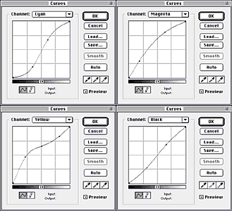
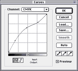
6 The image should
now begin to look cross processed, but
still needs further adjustment using the
curves command. These CMYK curve settings
were used to enhance the contrast in each
of the colour channels and overall
lightening the image in the CMYK and K
channels. (Note that I worked with the
brightness bar inverted from its default
setting).
|
|
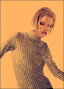
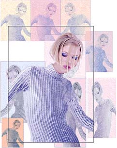
7 Here is the final
image. Pay special attention to these
shadow areas. Open the Show info palette
and take eyedropper readings. The total
CMYK percentages should not exceed 355%
of which 85% is black (depending also on
the printing stock you are using).
Anything beyond that will print as solid
black and detail such as there is will be
lost.
|
I used this
technique with a few variations on copies
of the original image, some were taken to
stage 2 only and adjusted with Hue /
Saturation. I also made a rough mask of
the background area and filled with
different colours.
|